Welcome!
Here are some basics to help you get started on this new venture;
CHOOSE YOUR ARTWORKS
Which artworks to choose first you ask yourself?
Generally, we advise you to choose your favorite artworks or those with a particular history for you.
These are the ones that you will sell the best because you have a special connection that is felt by your fans, family or friends.
You can also consider a flagship work from your assortment, or “recognizable” artwork or a signature style for you.
Then you can focus:
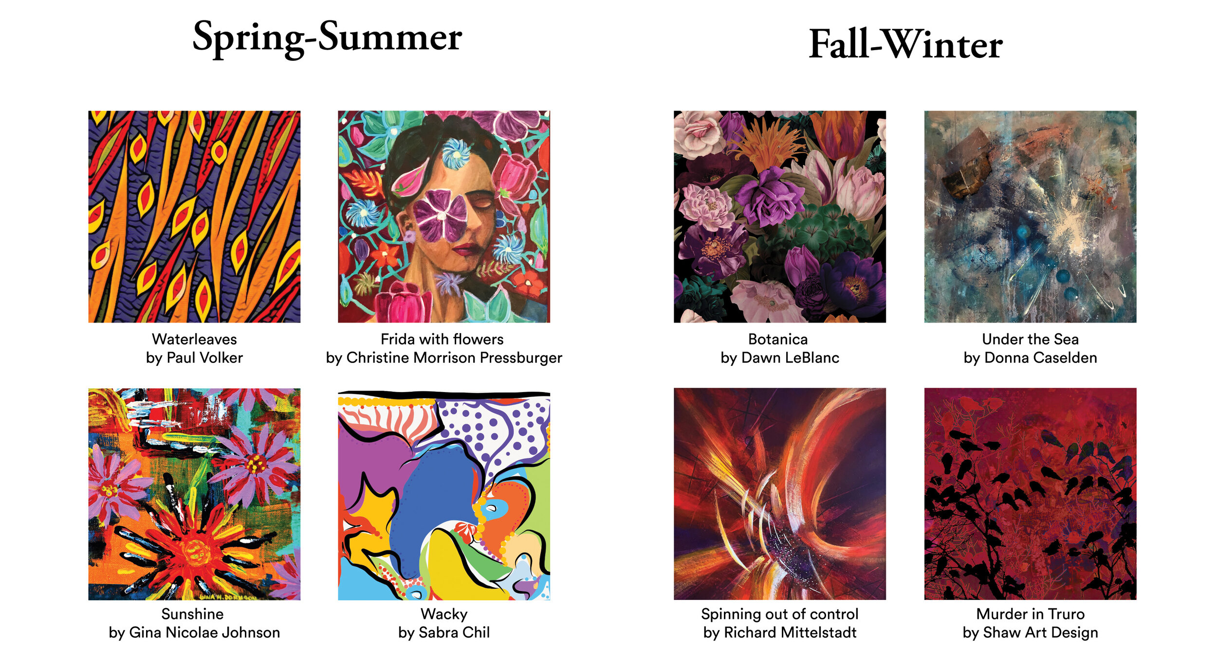
According to the seasons
In general, summer is more colorful and winter more sober.
You can therefore offer different collections depending on the season you are in for sale. For example, an artwork with a very colorful and vibrant face and flowers will attract more attention in June than in October. A black and red abstract work or in sober colors will be more watched in autumn and winter. It also helps that the pieces you sell go well with what is available currently in store. If you sell a tunic, you will need a pant
that goes well with it.
According to events
If you’re a part of an art event, you can trust the season in which the event takes place (above).
Otherwise, you can also go there by theme! If you participate in a Christmas market, why not include at least one holiday themed work?
It may sound ‘cheesy’, but you have great opportunities on Valentine’s Day, national holidays, Mother’s and Father’s Day, Easter, etc.
Offering special capsule collections creates an instant craze and gives reasons to share and communicate with your fans. The novelty effect and the limited time for the purchase of these products is a good boost for your sales in general.
According to your new artworks and special requests!
CHOOSE YOUR PRODUCTS
How to determine the right products for you
If you wish not to have exchanges or returns of your products, products without sizing are ideal for you;
Accessories, one size or home decoration
Play par Ellie Kort
For fashionable pieces that are out of the ordinary, large pieces like dresses or pants will bring out your artworks
in a grand way!
Fastwater par Kit Vincent
If your customers or yourself are looking for more everyday pieces, tops and accessories are perfect for everyone
L'Éstaque par Mel Davis
Of course, a mix of all these products is possible! These are only “typical” avenues that we have faced for years. The whole can also depend on the chosen artworks, some will not lend themselves to being very close-up on a dress and will be more highlighted on a scarf.
We also advise you to test in your design requests different types of products in order to discover your favorites and to show your loved ones the images of the designs. These will give you the exact picture of what they are thinking, you might be surprised!
Design Glossary
What important words do we commonly use? What do these words mean to us so that we understand each other well?
Mockup
Typical image to show how the design will be placed on the final product
3D Mockup
3D image of your products useful for presentation purposes and “brand” images
Transparency
A transparency effect refers to the lighter fabric, the threads are woven less tightly, and therefore to a result having a certain transparency compared to the initial artwork. You can see this effect in the mockups of the affected products. (It is therefore possible that your artworks appear lighter on certain mockup because of this)
Magnification - Zoom
Zoom in on the image in order to focus or avoid a particular element
Mirror / Symmetry
Effect of cutting the artwork in a specific place and copying the back half to have the same part of the work in opposite vision
Contrast
More contrast allows you to define the elements of the artwork. Less contrast will erase details. It can also lighten or darken the artwork depending
on the shadows.
Saturation
The color saturation level of an image, extremely colored to black and white
Brightness
The lighting level of an artwork, from very bright (white) to very dark (black) (Pale and blackened the image)
Cropping
Cut an artwork to reduce its size
Color balance
Ensure that colors are consistent with each other in the same color spectra
Pattern
Create a pattern from the artwork using one or more of the different techniques mentioned above. (Simple pattern = Repeating an image / Complex pattern = element of an image repeated so as to create a uniform, seamless pattern)
Repetition
Repeat an element of the work several times to create a pattern or a repeat pattern
Repeat pattern
Image repeated to create a continuous pattern that will not distort, regardless of the size reproduced
Resolution (Image Quality)
Ideal image quality is 300 DPI or 2500 pixels in height and width to prevent products from having a pixelated or overly enlarged effect
FAQ
How do colors come out when printed?
The difference between what you see on your mockups versus the final product can reach 8% difference in saturation.
Depending on the fabric on which your artwork will be printed, the colors may be more or less saturated.
Why is black to be avoided?
We produce black products without problem! But the “All-black”, a very saturated and solid black color, does not come out as saturated as we would like given that the reverse side of the printed fabric is white. Black may therefore appear more like a dark gray. This is important to know if you have an artwork that is mostly black.
Why can't we zoom in on part of my work?
Sometimes, the quality of the image does not allow an enlargement without creating visible pixels on the final product.
Why can't we shrink my artwork?
The artwork will not fill the entire piece of fabric and this would involve modifying the design considerably by adding parts in a “patchwork” manner.
It’s sometimes possible to shrink an artwork, however, when a detailed element of it is too close to its border, the "patchwork" will not be as beautiful, if not impossible. Be aware that this can bring some differences from the mockup to the final product.


